MyPru
-
The project
Prudential had an archaic system for people wanting to withdraw and manage their money involving the phone and postal system. Our task was to improve their self-serve platform MyPru so people could take care of their finances more efficiently online.
My role was to write:
• Onboarding screens
• Buttons
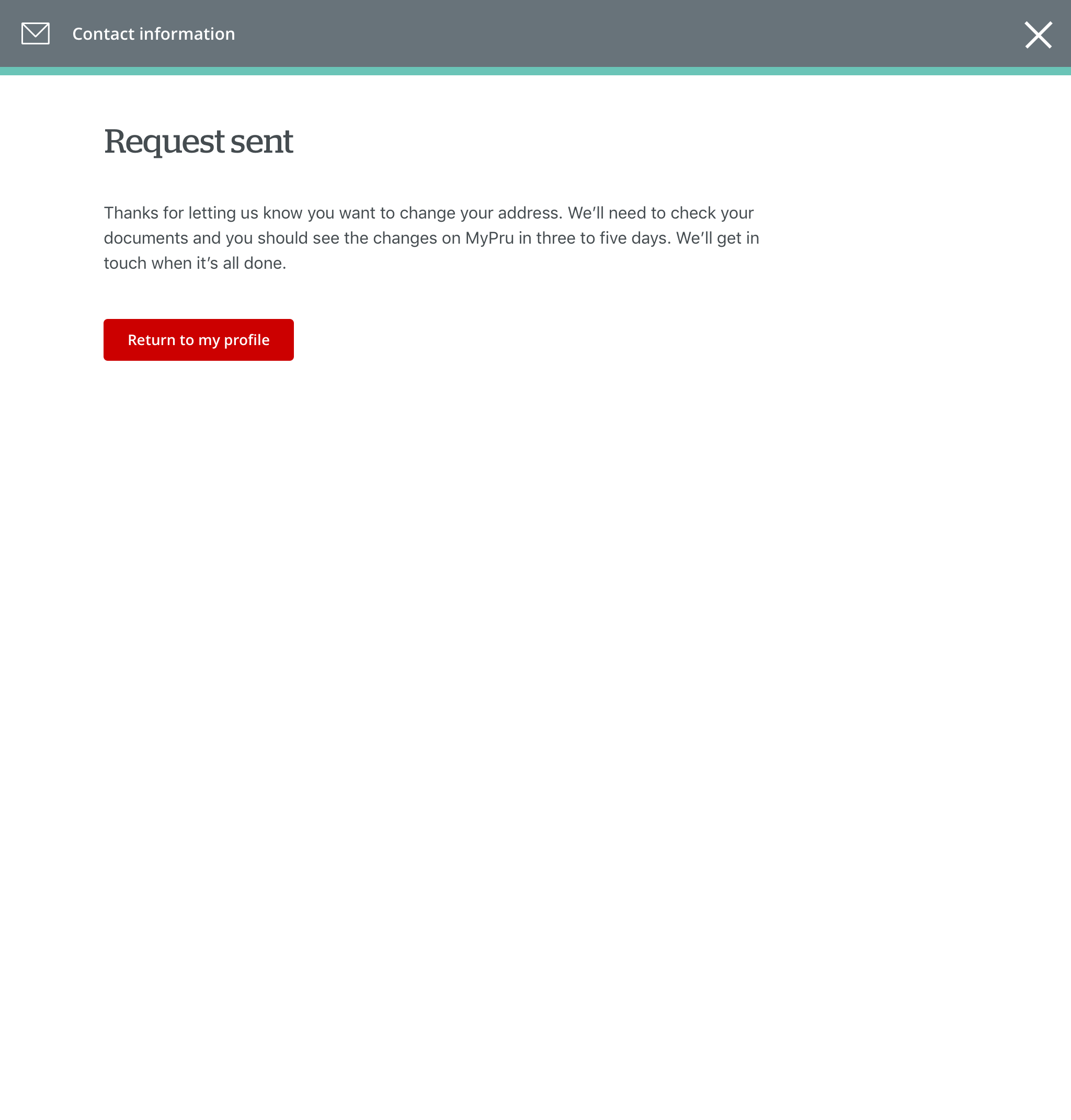
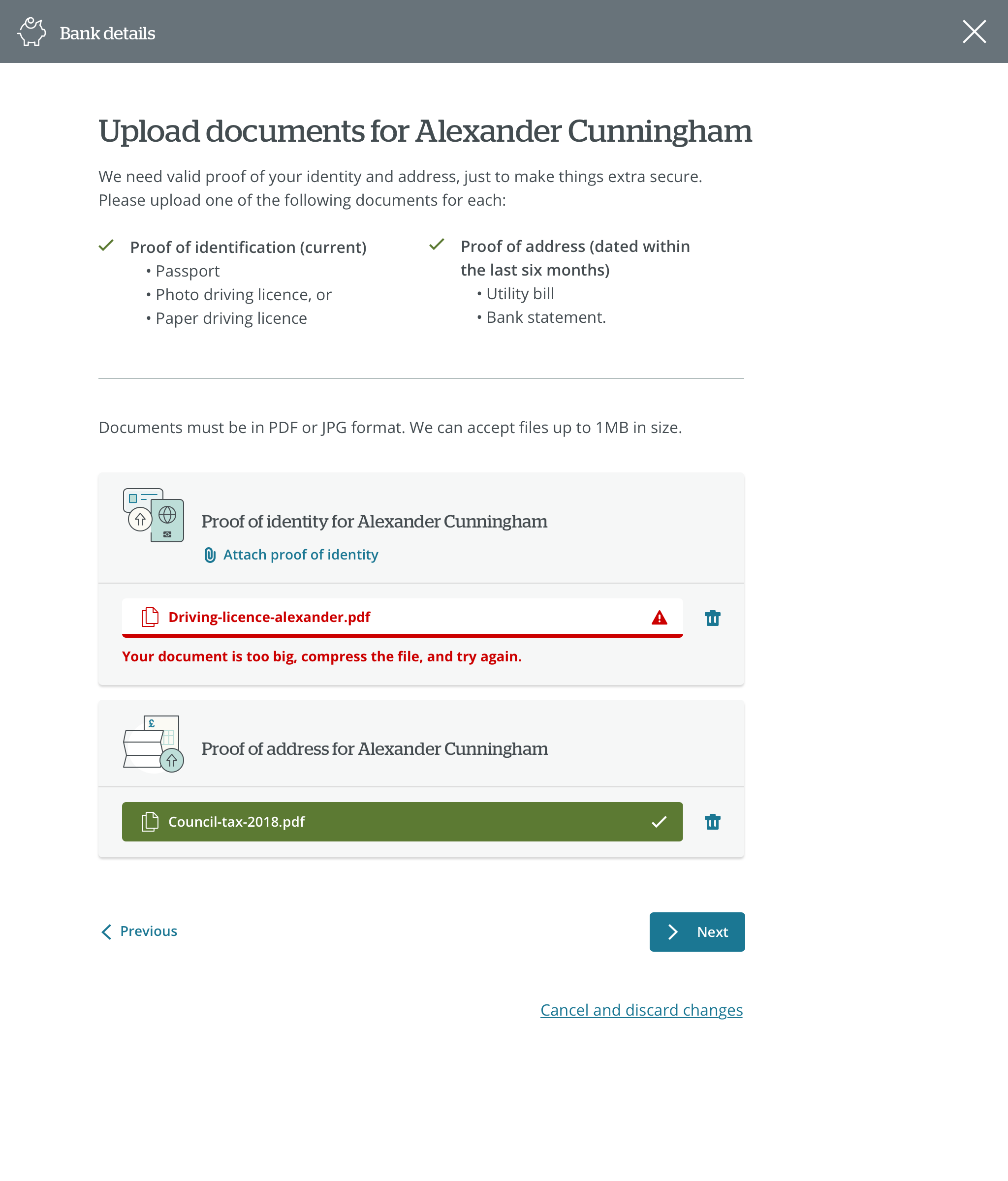
• Forms
• Error messages
• Confirmation messages
• Tool tips
• Help content including Q&As
• Articles. -
How we worked
I worked with a team of UI and UX designers together with a creative director. We had daily standups to discuss our plans for the day. It was quite an agile and flexible way of working with occasional meetings as and when we needed them. Sometimes the UX/UI designers would send me microcopy to write on Slack, other times we would put together a prototype in InVision.
This was a hands-on client-facing role so I often had to visit their office in Reading either on my own or with the team to discuss and/or present work. We also did a Google sprint for a week at the client’s office where we talked to stakeholders, outlined a scope of work, ideated, put together a prototype and tested it with users
-
Considerations
Prudential had an older customer base so we had to be aware of accessibility issues. This meant that we had to make sure that everything could be seen and read without perfect eyesight. We were also careful to reduce the cognitive load and didn’t assume too much technical knowledge.
-
Results
We created a platform that was simple and easy to use. This meant that customers could manage their own savings and investments online with confidence. Not only did this save customers time, but also reduced calls to Prudential’s call centre.


